Breaking Free from the Corporate Dashboard Design Rut
- Bre Ethridge

- Jan 3, 2025
- 4 min read
Let’s be honest—corporate dashboards can be...boring. You know the type: bland colors, uninspiring layouts, and so crammed with data it looks like a spreadsheet exploded. Yet somehow, this style has become the gold standard in a lot of industries—healthcare being a prime culprit. Why? Because “that’s how it’s always been done.”
But here’s the thing: dashboards don’t have to be dull to be functional. The best dashboards strike a balance—they tell a story, capture attention and make the data easy to digest. So why is it so hard to break free from the corporate monotony? Let’s unpack the challenges, frustrations and small (but mighty) victories I’ve experienced along the way.
Why the Excel Mindset Still Reigns Supreme
Here’s a truth about corporate culture: people trust what they know. The Excel-style dashboard feels familiar, safe and reliable. It’s like the old, slightly uncomfortable recliner your parents refuse to get rid of—it’s not the best option, but it works, and they’re used to it.
In healthcare, especially, I’ve found that leadership tends to see dashboards as glorified spreadsheets. They’re not looking for storytelling or innovation; they want to see all the data laid out at once, even if it’s overwhelming. It doesn’t matter if it’s messy, as long as it’s there.
And honestly? It’s maddening. When you know that modern dashboards can make their lives easier—helping them make quicker, more informed decisions—it’s frustrating to see those ideas dismissed simply because they’re “too different.”
What Modern Dashboards Bring to the Table
Now, let’s talk about the other side of the coin. Modern dashboards—like the beautifully crafted example by George Lov below—don’t just look nicer; they work better. Designed to highlight what matters most, they reduce the noise and make insights easier to find. They bring data to life in a way that’s both engaging and actionable.
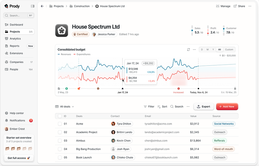
Instead of drowning in a sea of numbers, these dashboards make the data approachable and user-friendly. They simplify the process of identifying trends, tracking KPIs and making informed decisions—all while looking polished and professional. It’s proof that good design isn’t just about aesthetics; it’s about making your data work for you.
One VP once told me, “This feels like Instagram for data.” While it wasn’t exactly the compliment I was aiming for, it did get them thinking differently. And that’s half the battle.
The Corporate Standoff: Innovation vs. Tradition of Dashboard Designs
So, why is change so hard? Because breaking old habits is uncomfortable. Many leaders have spent decades working with data in a certain way, and they’ve seen plenty of trends come and go. They might see modern design as risky, frivolous or just plain unnecessary.
It’s not just about the dashboard—it’s about changing their entire way of thinking. And that takes time, patience and a whole lot of persistence.
How to Start Changing Minds
Shifting a deeply ingrained mindset takes more than just showing off flashy visuals—it requires strategy, empathy and persistence. Over time, I’ve learned that the key isn’t just about proving why modern dashboards are better but also about meeting people where they are. Understanding their hesitations and showing how these changes can make their lives easier is what truly makes the difference.
Here are some approaches that have worked for me when tackling the “Excel-first” mindset:
1. Reverse the Power Dynamic
Start with frontline users who work with the data daily. Let them experience the efficiency and clarity of modern designs. Gather their feedback and demonstrate to leaders how their teams are already benefiting. This grassroots advocacy can create undeniable buy-in.
2. Storytelling Through Design
Reimagine dashboards as stories, not tools. Use modern designs to craft a narrative that resonates with leadership—highlighting progress, opportunities and risks in a visually captivating way. Show them how a well-told data story can drive decision-making like nothing else.
3. Shock and Awe
Create a bold, experimental prototype to shake things up. For example, transform their Excel-style dashboard into an interactive, visually appealing design with real-time updates and predictive trends. Seeing the stark contrast challenges the belief that “this is the only way.”
4. Challenge Their Pain Threshold
Quantify the inefficiencies of their current dashboard. How many hours are spent searching for insights? How many errors are made because data is buried? Present the cost of staying stuck alongside the clarity and time savings of modern dashboards. Make it impossible to justify the status quo.
5. The Minimalist Experiment
Redesign their existing dashboard with just the essential metrics, removing all the noise. Present both the original and minimalist versions side-by-side. Show how simplicity doesn’t mean sacrificing depth but instead enhances usability and impact.
6. Highlight a Competitor’s Edge
Tap into their competitive nature. Demonstrate how other organizations in their industry are leveraging modern dashboards to outpace their competition. The fear of falling behind can be a powerful motivator for change.
Conclusion: Winning the Long Game
For me, every small win—like the time a VP admitted the new design made their workday easier—feels like a victory worth celebrating. Changing the corporate dashboard mindset isn’t easy and it’s not fast. But it’s worth it.
The next time you find yourself fighting for better design, remember: you’re not just building a dashboard. You’re changing the way people think about data. And that’s pretty powerful.
Comments